Announcement

Collapse
No announcement yet.

First post - inspired by thirst :)

Collapse
X
 
  • Filter
  • Time
  • Show
Clear All
new posts

  • First post - inspired by thirst :)

    Hello to everyone!

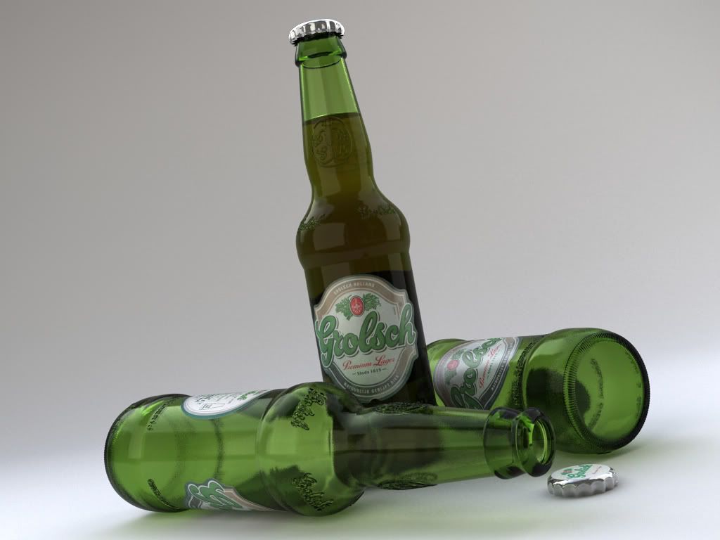
    This is a very recent side project I have been working on at Teabag Studios...the scene composition and lighting are still being modified at the moment so i would say this is just a alpha final


    C&Cs very welcome...

    Martin Zmeskal
    Teabag Studios
    teabag studios

    www.teabagstudios.com

  • #2
    Hm. Seems very "clean" for bottle glass. Maybe put some bump ? And I really don't like that much caustics
    I just can't seem to trust myself
    So what chance does that leave, for anyone else?
    ---------------------------------------------------------
    CG Artist

    Comment


    • #3
      the thing is that i have already a map that i am using for displacement in my bump slot.....i reckon i could put some noise in the glossy reflection slot ...and i ll lower the caustict they are a bit over the top...

      cheers

      btw....the glass i have on my table is pretty clean..
      teabag studios

      www.teabagstudios.com

      Comment


      • #4
        Looks great! The caustics need a bit of refining, otherwise super job!

        Comment


        • #5
          Nice bottles! Your lables need a little more shineyness and need contrast, and your bottle tops are a bit too chrome like, otherwise I'm gettin' thirsty too.

          Comment


          • #6
            Originally posted by teabag
            the thing is that i have already a map that i am using for displacement in my bump slot.....
            You can use a mix map, and have the noise appear only on the areas where the displacement map is black, or simply mix the two maps 50% each (or whatever percentage suits you).
            In case the bump on the logo gets dimmer, raise the output value for the logo bump map.

            nice render, btw.

            Lele

            Comment


            • #7
              Love it.

              Well done!!

              Comment


              • #8
                Is your company seriously named "teabag"?
                Tim Nelson
                timnelson3d.com

                Comment


                • #9
                  nice bottle. really.
                  what method do you use for the bottle if i may know ?
                  Dominique Laksmana

                  Comment


                  • #10
                    Seems like it's a lathe for the actual model itself and a displacement map to make the logo and other small details - They'd be far too irritating to model in

                    Comment


                    • #11
                      Originally posted by timmatron
                      Is your company seriously named "teabag"?
                      hehe. i was thinking the same thing. hopefully, it's come from a different place from where our minds currently reside.
                      Matt English
                      Harper Perkins Architects / base2studios
                      VizDepot.com Moderator
                      AArch2008/VIZ2008/VRay ONE POINT (WHOOHOO) FIVE!!!

                      Comment


                      • #12
                        Thanks for comments everybody....
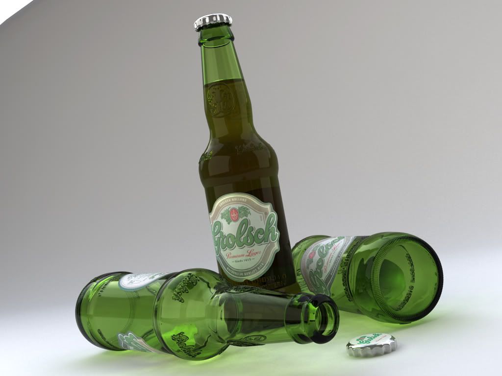
                        ...here is the updated version where the glass surface was distorted a bit by noise in the bump slot with a very small grain (0.01mm) and no blur ...i am not still sure about it though...
                        The caustisc were improved and i am satisfied with the result as well with the contrast and shininess of the label....
                        The cap still needs some tuning....ill probably build it again with more detailed geometry...


                        The model is a lathe, split when modelled so i could use 2 different uvw for the bottom of the glass and for the body...then i used 3d displacement with 1.0 pixel definition.

                        To studioDIM: Thanks for the tip!
                        To timmatron: The comapanys name creation is surrounded by mystery
                        teabag studios

                        www.teabagstudios.com

                        Comment


                        • #13
                          Looks good mate.
                          Personally i would prefer a brighter image and stronger caustics.. more like the first ones.

                          Just the image seems a little to dark for me.


                          damn it.. im thursty..

                          Comment


                          • #14
                            I also like the "clean" version better....
                            do you see the image darker? because on my monitor i can see the image with the same level of brightness...
                            or it might be the stronger caustics that make the image somewhat darker....
                            teabag studios

                            www.teabagstudios.com

                            Comment


                            • #15
                              does this dispell the mystery?

                              http://www.urbandictionary.com/defin...term=teabagger
                              Patrick Macdonald
                              Lighting TD : http://reformstudios.com Developer of "Mission Control", the spreadsheet editor for 3ds Max http://reformstudios.com/mission-control-for-3ds-max/


                              Comment

                              Working...
                              X