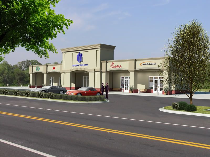
Seems like it was Montage week. Well..I did my first "lunch and learn" with new clients. We gave a small presentation to a local developer/realtor. Went in with boards, laptop, fruit salad, delicous subs and etc. LOL Wowed them with some animations and then took one of their sites and did a QUICK montage of a building that we had done... We changed it up a little, but they were impressed. So here is the project we did for them, which grabbed us two new projects. Again...comments are welcome...
Announcement
Collapse
No announcement yet.
Another Photomontage
Collapse
X
-
I'm sorry, but this is ugly. I really didn't want to waste more time than I already did with a reply, but why did you post it?
-
Wow, that's a really harsh comment, but i have to admit it's not far from truth.
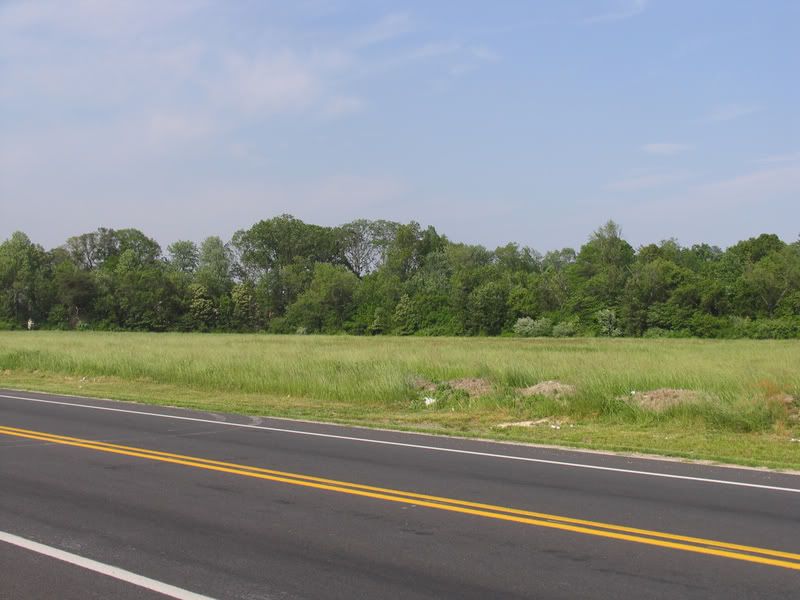
First of, the original image can be any side of the road, with any hedge with any trees in the background. And even after that, most of it is concealed.
If you have to use that particular image, and than show a comparison, then it's understandable to use it. But otherwise you'd be better off creating the 3d image from scratch.
I've tried editing the image a bit in photoshop, but i don't have my wacom set up, nor too much spare time, i think you need to either set up a better scene, or spend a lot of effort photshopping it.
Dusan Bosnjak
http://www.dusanbosnjak.com/
Comment
-
Geezus, meanadam.. mean.. no kidding.
How about some constructive criticism. Im wonder why you bothered posting... rough day at work? needed to vent? sheesh
Eric,
The image needs a fair bit of work to look great. All the trees and shrubs have no shadow at all obviously PS'ed in. Maybe look at 3d trees and shrubs.
The scale seems a touch out and the lighting doesnt match all that well.
From this distance it looks like there are no textures used at all, just flat colors. Need some variation.. textures.. something.
I think all the PS stuff is somewhat killing the image.. looks was to PS'ed.
Plus it probabaly doesnt help that the building is boring as batshit but thats nothing to do with your work.
Anyway mate, good start just needs some more tweaking
Comment
-
I've posted a tad better image, i've missed a layer on the first one.Dusan Bosnjak
http://www.dusanbosnjak.com/
Comment
-
If there's no specific reason to use the montage, I'd ditch the montage photo and model everything in 3d.
This way you could put your camera anywhere on the site, put your own lighting scheme, add a bit glossy reflections on the road, etc etc
Regards,
HarryHarry G
Comment
-
they dont call him "MeanAdam" for nothing
This is not what many -if any, would classify as a photomontage in its strict sense, the building doesnt really blend into a scene- rather you used forground (Road) and background (trees) from a photo- both of these are commonplace.
Whats you lighting setup, why arent you getting shadows from the trees,
I know you probably dumped the in after render but it cant be believeable without lighting/shadows on them.
This can easily be achieved with shadow maps and your lightsouce,
you should also do some Photoshop colour corrections, PS is sooo important, cloned plants are as a big offender as a repeating tile on a texture map. I would add cars to the left of the building so as to hide the seam between the path and the tree line in the photo,
regards,
TOmAccept that some days you are the pigeon, and some days you are the statue.
Comment
-
Montage could be necessary, if the clients wants to see the building 'appear' in the land he baught... like a before / after shot..
That is a restriction that we oftenhave, put my building where it should be.Alain Blanchette
www.pixistudio.com
Comment
-
there's nothing wrong with the back plate. You couldn't model, light and render that background to be more realistic then what you have in the photo. The OP just needs more work on matching lighting in his scene with his backplate. He'll get better with time.
Meanadam: Frankly you owe Eric an apology. He posted here to get some help with making the image better. If you wish to alienate yourself from this board, then by all means continue.
Comment
-
well, i tried to be as positive as i can to interpret meanAdam's reply, but i just couldn't. there's no other painfull experience other than getting that kinda comment from a fellow visualiser. so i second that percy....
as for eric: i would either ditch the photoshoped trees, or put shadow beneath them or simply put 3d trees there. and maybe create a tree's shadow at the foreground side of the road. it helps.
as for the texture on the building, maybe too far to see in this resolution.
the humans need shadow as well, i guess.Dominique Laksmana
Comment
-
Hi Eric
It looks to me like you have good details in the model - the kerb with grass offset a bit and the shopfronts and glass look particularly good.
As mentioned shadows and reflections are vitally important to make your building 'feel' part of the scene. You can see from Pailheads post how photoshop can be used to manipulate an image - the client usually wants to paint their building in the best light and sometimes the photo itself will require manipulation too - brighting up, saturation adjustment, nicer sky etc.
I would also be cautious in how you add lights - be carefull not to flatten the image by making the lighting too even - you should be able to squint and see the light and dark areas clearly - this will help with the realism.
Good start, keep going mate.....-Peter
Comment
-
WOW...I am not sure where to begin.... LOL.....
I was going to quote and replay....but Geez....that would take a while...
I should have clarified a little more, but Here I go. If you guys look back from my posts...This was another clients building that we basically used as a "tester" for a "future client" We tweaked the structure a LITTLE as not to use the actual design, but all we really did was grab the phto of the site from the new clients website and then STICK the new building on....I should have stated better that we did not CAMERA MATCH the site....I know..I know...why even bother right? Well...Like I said we did a little lunch meeting with them and used this at the very end of the meeting. We showed them basically a menu of everything we do..3D Extertior...2D Site plans...Montage..Animations etc..etc.. And at the end...this image...just to bring it close to home....and we faded it in and out several times, just to show them that everything not be THOUSANDS of dollars. That was really the point...
But it did snag us a couple of jobs and writing a couple more proposals right now...So it was worth it...
I must say one thing though....You guys must know and everyone knows that we post here for a reason...Get some comments....feedback...and make our work better. I mean I know my stuff has been better and from project to project can vary....But I appreicate all the support and help I have received here. I shall refrain from commenting on the other. I frankly don't have the time.
Comment
Comment