If this is your first visit, be sure to
check out the FAQ by clicking the
link above. You may have to register
before you can post: click the register link above to proceed. To start viewing messages,
select the forum that you want to visit from the selection below.
Exciting News: Chaos acquires EvolveLAB = AI-Powered Design.
To learn more, please visit this page!
New! You can now log in to the forums with your chaos.com account as well as your forum account.
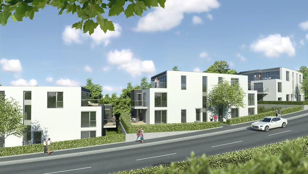
these look nice, but to nitpick....In the second image my eye immediately goes to the shrubs. Something about them makes them look too cg, maybe the highlights? Also the leaves on the top look like you used a "fill in flash" and perhaps could be darken a little?
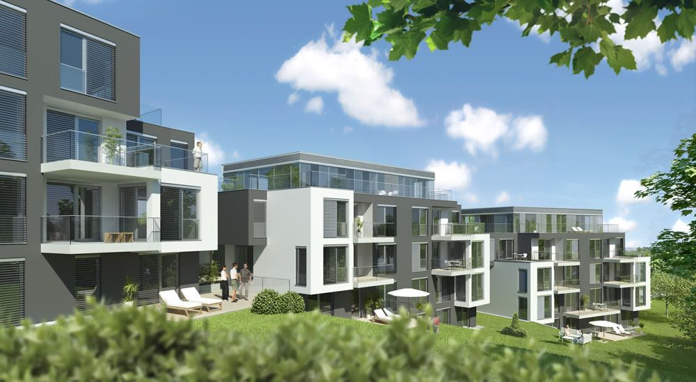
agree with the above poster. Shrubs have too much contrast. and try and highlight the upper portion a tad so that they dont look so flat. The first image looks nice, I would overlay some sort of texture over the grass to give it some varation in color.
____________________________________
"Sometimes life leaves a hundred dollar bill on your dresser, and you don't realize until later that it's because it fu**ed you."
Since my neighboor can look straight into my penthouse, I don't think the Maserati represents the pricing of the appartments. I learned to be very careful in choosing the right cars in the right (not so prominent) positions
The lighting is nice! I think that the hedges need some variation in leaf colour...and possible the density or position. They just look a bit too perfect...like on a train set!
 Tweet
Tweet


Comment