If this is your first visit, be sure to
check out the FAQ by clicking the
link above. You may have to register
before you can post: click the register link above to proceed. To start viewing messages,
select the forum that you want to visit from the selection below.
Exciting News: Chaos acquires EvolveLAB = AI-Powered Design.
To learn more, please visit this page!
New! You can now log in to the forums with your chaos.com account as well as your forum account.
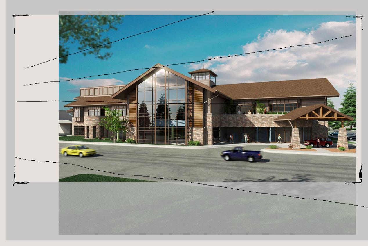
I would say that a good place to start is some colour correction. Nice images by the way! The daylight image is too blue...that time of day would be more towards the yellowy, orangy, warm type colour. And the dusk should be more blue-ish....with a bit more of a colder feel to it. I did a quick colour correction and it really does change the look and feel....i can post it later if you want. There is a little bit of tiling going on in the stone and the shingles.
Thanks. I curved it a little mostly brightening it and a little warmth though the original does not appear blue on my screen. Unfortunately no time to work on the tiling, the roof isn't that bad at hi res.
Though I think they're going with this NPR version
Your textures are tiling really, really badly.....sorry to be so harsh.....but we learn through the complete honesty of others...not by hearing only nice things.
Keep at it though.....there is lot to learn in creating wonderfull 3d renders...so keep trying & never give up!!!
I have little more time to comment.., first I love the image.
If it were mine I would lower the camera and raise the target. I would show less of the foreground grass, more sky, and get rid of the zooming cars. I like how you have the focal point, which to me is the large plane of glass, to the left of center. Lowering the camera would place the focal left of vertical center and below the horizontal center. I personally don't like the horizon line to be smack-dab in the middle of a picture. I love your light flare effects, too! You can also, in your image editing program, clone out some if the roof tiling going on; it'll only take a couple seconds.
Thanks Bobby. Good tip on using photoshop clone on the roof. I think the foreground grass is crucial to the image otherwise it would be pavement heavy and I usually insist on a level camera and vertical lines being vertical unless I want it to look tall which I definitely don't here. Architects in small western towns are very picky about that. I think a lower camera position could still be better though with high quality grass and a little dof. I wish there was a hedge or planter there but no. The light flare on the windows is very simple in PS; copy base layer, adjustments > levels > move middle and left sliders to the right, set layer mode to "screen", duplicate layer, motion blur one of them 45 and the other -45, merge the 2 layers, play with opacity, sharpening, masking etc. Basically a poor mans star filter. Specular render element would prob also work well. A really good HDRI helped a lot with this http://3docean.net/item/hdri-1725-sun-clouds/87810
"A severed foot would make the ultimate stocking stuffer"
-Mitch Hedberg
I'd like to make a suggestion about the composition and crop...
IMO the sky, roof etc is OK, it doesn't really matter that much if you have to most perfect sky, or not.
The point of view is OK, and the field of view too (it wouldn't hurt if it was a bit wider, to accentuate the perspective, in combination with the road)
But the composition is making me a bit uncomfortable...when i look at it i get the feeling that the image wants to break out on the left.
I'd crop it more like this:
edit: you blurred the tree on the top left in the foreground...it should be sharp, unless it's really, really close to the lens.
I agreed with all the commentaries about the composition as well as the textures...camera needs to go down for sure, i'll work a little more on details like lines for the road, better cars (and colors)...adding something nicer to be reflected by the huge glass (treeline at lease)
I had a little time to try a lower viewpoint. Not sure if I like it better or not but here it is. I would like to get a nicer collection of cars but too broke at the moment, I did desaturate them some which helps. Out left is an existing structure that I don't have a good model of and I like how the big window obeys the rule of thirds. Specular is prob a little over the top and I agree that more needs to be in the reflection besides the trees.
much better!!..there are some nice free cars online, I think axyzdesign has a couple....since you have motion blur on them you could use those lowpolygon3d cars or even cutouts
 Tweet
Tweet


Comment