If this is your first visit, be sure to
check out the FAQ by clicking the
link above. You may have to register
before you can post: click the register link above to proceed. To start viewing messages,
select the forum that you want to visit from the selection below.
Exciting News: Chaos acquires EvolveLAB = AI-Powered Design.
To learn more, please visit this page!
New! You can now log in to the forums with your chaos.com account as well as your forum account.
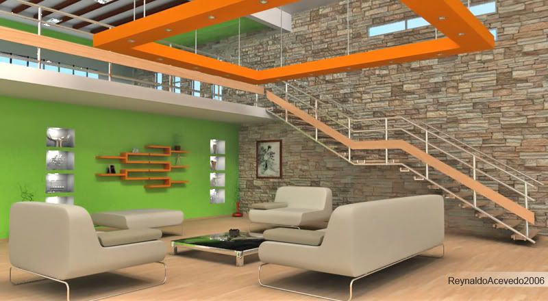
I would try to avoid the greyish light at the background wall boxes and try to find a more natural lighting. It looks so homogeneously like a theater stage. I miss the feeling of windows and room lights.
ohh if what happens it is even that affluent nonhandling that of which the light me between from the outside but thanks for your commentaries will take them into account
it excuses my inglish
Por fin alguin de habla hispana por estos lugares!!! jaja!!
El render esta muy bien para ser tu primera vez!! (si es que no nos enga?as). La verdad es que para llegar a los niveles que se ven en este foro hay que espabilarse mucho, pero ya veo que tu ya has empezado. :P
Quizas deberias definir un poco mas los sofas, las formas parecen tan duras, que junto con el color, no parecen que sean reales. Puedes trabajar tambien en la iluminacion general de la escena y en algunos materiales en particular, como la madera. Sin duda son otros dos aspectos basicos en un render muy potente.
Espero postear un render pronto y asi tu tambien me podras dar ca?a!! jaja!!
en lo que respecta a mi primer interior me refiero en vray para rhino antes los hacia en flamingo y aunque no es lo mismo tengo algo de experiencia ademas antes de hacer el interior me pase varios dias aprendienco a configurar ciertas cosas no es que sea mi primer render en vray para rhino solo que si fue el primero que no fue un simple test
lo que me viene a dar cuenta es que si existen tutoriales del vray para rhino aqui no lo sabia quiizas los emple en el proximo
Camera Angle:
#1: Modify the camera angle in a way that those two lines does not match.
#2: idem as #1 more or less.
#3: We should see more of this window but not only a small chunk like this
#4: You have an hidden visual straight vertical line in there, pretty much at the center of the picture. put it a little bit more on the left to brake this alignment.
#5: those plants are awfull in this interior. Change it for something bigger or remove it.
Color:
As Micha said, a lightning a little bit warmer.
For the green wall, maybe reduce slightly the saturation.
Add the glossiness and reflection to the floor, but not too much.
 Tweet
Tweet


Comment