 Tweet
Tweet
Hi,
Is just one for now...C&C are welcome
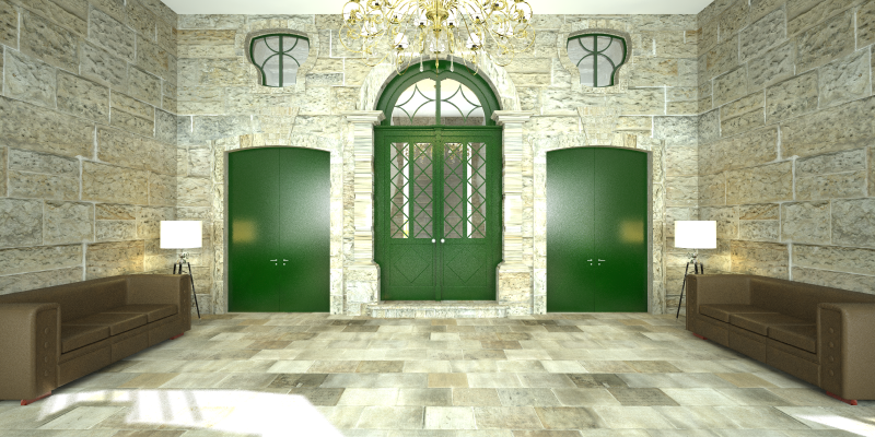
Interior Hall
Is just one for now...C&C are welcome
Interior Hall
 . (What are those red thing under the couch?)...
Comment