Announcement

Collapse
No announcement yet.

israeli street (wip)

Collapse
X
 
  • Filter
  • Time
  • Show
Clear All
new posts

  • israeli street (wip)

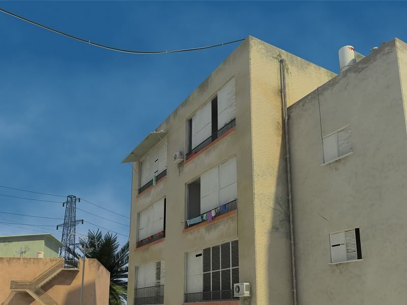
    hey, i got a few days off from work so i have some spare time :P this is something i started yesturday, i've been working on it for 20 hour...
    the idea i had is to creat a model of an old nighborhood in israel. there are a lot of places in israel that have these old buildings. my main focus is on textures (though i love modeling so i cant help it). i'll add some trees in the background..any comment will be great. thanks

    [img]scrool down[/img]
  • #2
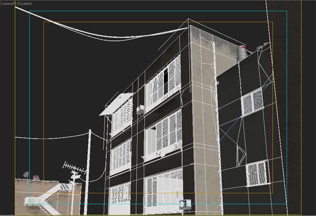
    impresive dude !! i like it , very realistic , please show us a wire!!!

    Comment


    • #3
      thanks..heres a wire

      Comment


      • #4
        great good job!

        Comment


        • #5
          wonderfull job dude, can u show us that wall mat? congrats man, maybe with some higher AA it would look even better..just a thought...damn that wall is awesome

          Comment


          • #6
            That's wonderfull, great atmosphere. Very natural.

            Congrats,

            Erik
            A full render queu is a thing of beauty !

            Comment


            • #7
              Its ok, but it lacks allot character. Yes you have the water stains, but those don’t make it "old” Right now you have pristine buildings with waters stains, that’s basically it. The stucco on the walls lacks real "texture" and depth. I would suggest exposing some brick, or showing some chipped stucco with some different color material underneath.

              The air conditioners would have more of water stain then the balconies because 1 it is affected by all matters of rain and 2 they produce condensation. Also the window with the covering would have less water stains, because it is being slightly covered and im sure that the moisture content in the area is very small.

              The pole in the background looks like a plain cylinder, and doesn’t represent "old" at all and looks very out of place.

              Lighting, right now the shadows are pretty well horizontal (look at the vent on the upper right) it suggests along with the color of the buildings that it is either sunset or sunrise, yet the sky suggests nothing of that.

              Contrast: Well take a look

              As you can see, in gray scale the whole image is basically midtones, and the levels proves that.

              Depth: Right now the wall on the far right is fighting over dominant space with the wall behind it, possibly bringing in a little more GI shadows from the outer wall would make it pop more, either from lighting or post in PS.

              It’s a good start, don’t get me wrong, but it has a ways to go.

              Comment


              • #8
                lordshaitan: well thank you for taking your time to write this, about the texture - i'm not sure what you mean by "showing some chipped stucco with some different color material underneath" but i'll try painting it some more in photoshop. i think youre right about the pole, it has a wood texture on it but it gets washed out by the light for some reason...
                i'll try to do something about the light position, i was going for mid-day light not sunset or sunrise. and i'll try to work on the depth. i'll post and update later today.
                thank you very much!

                Comment


                • #9
                  Well what i meant is, that one layer of stucco has chipted off and its exposing another layer. Well like this.

                  I hope this helps

                  Comment


                  • #10
                    heres an update

                    Comment

                    Working...
                    X