If this is your first visit, be sure to
check out the FAQ by clicking the
link above. You may have to register
before you can post: click the register link above to proceed. To start viewing messages,
select the forum that you want to visit from the selection below.
New! You can now log in to the forums with your chaos.com account as well as your forum account.
It's pretty much just mapped area lights alright or in the case of something that's totally chrome and thus doesn't really have any diffuse to accept lighting, you could actually only use cards with vray light materials with a gradient map, and not bother using any lighting at all.
The placement is the only time consuming thing, use lots of the place highlight tool to try and position lights, and turn them off one by one so you know exactly what's doing what. There's a sneaky trick you can do with colour values in a mapped sphere to place things too.
You can also speed up the area-light placement using VrayRT if it works in your scene.
I agree that it is useful to map the lights with gradients or HDRI-maps of studio lights if your object is very reflective.
I don't like to light those scenes with only a spherical HDRI.
It's very hard to finetune your image that way.
Start with the biggest and brightest lights and continue to add more lights where needed to define the objects form.
It's not necessary to copy the traditional studio setups to get good results.
I have a scene here for lighting Continental tyres with chrom-rims that would be impossible to recreate that way in a real studio.
The light placement in that scene looks strange and random but the renderings get printed without any postwork at all.
I also like to work in the default gamma space so that i can keep more control over the lights falloff
and don't have to tweek S-Curves in order to get a nice high contrast image.
do you guys know any trick how to control this gradient reflections. I put it into environment with spherical env mapping but it;s hard to control it without preview n the scene.
Image mapped lights is for sure the way to go. HDR domes can give very nice results but does not give you the level of control necessary for that kind of high quality lighting. I think RT is almost essential too though: In my opinion it would be extremely difficult or take a very long time to try and light shots like those without RT.
Aside from the tool kit needed (the mapped lights) there is a pretty good photographic eye driving the lighting on those images you posted, and just having the tools will not give the results any more than a pro camera makes you a pro photographer I think you need also be prepared to spend some time and patiently tweak your rig to get such nice lighting.
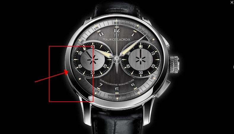
Since the surface of the watch is using totally sharp reflections then it means that you actually have to have a plane mapped with an actual gradient - it's physically being reflected in the face of the watch - the white section between 7 o'clock and 4 o'clock is another light mapped with a much brighter gradient placed in front of the mapped plane you have highlighted.
I agree with simmsimaging. It's not really about the lights, it's about the reflections. It's so important to remember that those are 2 seperate things. By placing gradients onto planes or even in a vray light material applied to a plane, you'll have to move it around in the scene until it's reflecting just right in your object. If you're really good you can learn to do this in your HDR environment map, but that takes a lot of time and experimenting know where to place the colors and shapes. The HDR Light Studio pro software may has some good examples on their website of what these maps look like.
There's pretty much no need for lights in this scene. Silver has no real diffuse part to its surface to receive diffuse light, the shape of the entire model is being defined by reflections. I did a small end sequence for an opel commercial a few years back with their logo. First version of it looked quite nice but their branding was being handled for a really anal dickhead (I thought at the time) in a print company who'd circle precise areas of the print logo and point out the differences between the 3d logo and what they use in their print campaigns. At the time it was rare that you'd be asked to exactly match something. I wasn't actually instructed to do this before said print bloke stepped in, and through gradual revisions it became evident that he just wanted his print logo exactly reproduced. Annoyance aside it turned into a brilliant learning exercise that can extend to any pack shot, car shot or product shot as it's all about placing lights and in this case I mean placing lights that have gradients mapped on to them so it's kind of about placing cards with coloured gradients. On a glossy material you can use solid colours and the width of the light to control how the gradient falls off, and with sharp chrome materials you use either normal planes with gradient materials, or area lights with gradient materials if you need to have some actual light too.
Mostly I agree with John - but I think it's worth doing with image mapped lights, or cards with VrayLight material, because the direct light and GI do make a difference in a lot of subtle ways, so it's not *just* the reflections that matter. They are the key though.
For my money, image mapped vray lights are the best bet. The offer the most control, work very similarly to "real" lights so they are more intuitive, and are very well optimized for speed. The only downside is that you can't see the image map in the viewport, but with RT that's a minor issue. I use mesh lights or simply VrayLight material whenever I need to create odd shapes to get nice highlights/reflections - one's that can't be created with squares and circles etc.
Comment