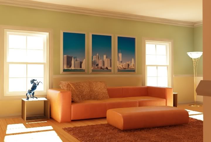
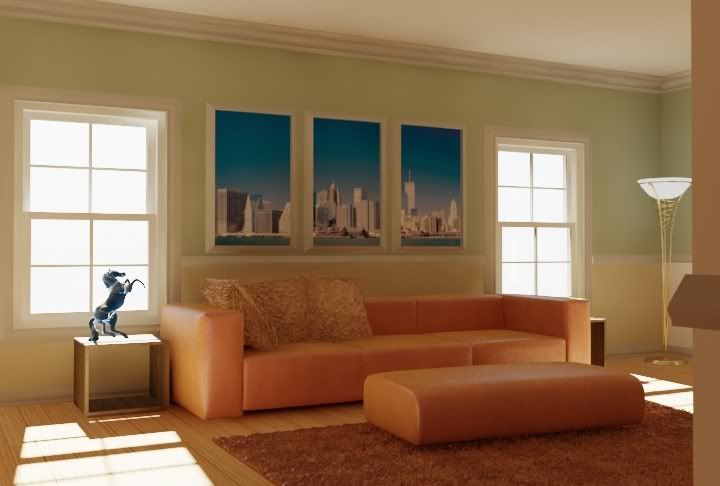
That lamp looks almost as bright as the sky outside - it shouldn't be anywhere near as white as that. Maybe a bit of bloom around the windows in post too. Looks good though.
Announcement
Collapse
No announcement yet.
Splothces and more
Collapse
X
-
i would also turn off the light for the final....looks weird with bright day outside and internal light on
best regards
martin
Comment
-
Lele,Originally posted by studioDIMDo set a very wide scissor between min and max IRMap settings, something like -7/0 or thereabout, and watch the splotches go away
Lele
I'm curious...have you gotten this to work before with such a high Max value. A Max value of 0 is usually going to give you great deal, ie, reduce the size of the splotches and in effect make them stand out more. Also, I can't imagine a scenario in which vray would even settle for such a low Min, unless you went crazy with some of the clr, nrm, dist, thresholds. On a 1000x1000 pixel image, -7 would yield a irradiance map resolution of 8x8, which would never do an image any good. Lowering the ir map resolution certainly removes the splotches but reduces detail. Inter samples reduces the splotches by adding additional information between the samples, and doesn't have nearly as dramatic effect on blurring of detail. In other words, a Very Low preset (-4/-3) can give you a very smooth image but not much detail. In this scene, to maximize quality/versus render time (assuming render time is of some importance), I would use:
Medium preset
20 HSph subdivs (you really don't need more than this on this kind of scene)
50 Interpolation (increase as necessary to remove splotches)
Adapt QMC with a Min/Max of 2/5 (or 3/6 if necessary)
Disable the 'Use QMC thresh' value and lower the Clr thresh to see if there is more detail to bring out without too much increase in render time
Leave the QMC Noise thresh at 0.01
As mentioned, i would definitely turn off the interior light.
Just my humble opinion
Comment
-
I agree with the light..>I wasn;t getting enough light with the outside light, but after a quick PS brightness edit and some others....It looks good. I am rendering a large res at work right now with a detail enhance on and higher IR map settings. But they are going away little by little....
Comment
-
It might be a bit late at this stage (sorry, you can just ignore it anyway), but i think overall the scene looks a bit too saturated, even after you use exponential colormapping. Have you use LWF method?
And i noticed some burnt area on the floor & tabletops. I normally won't get those with exponential.
Anyway it looks much better than the first one!
ps. your 'life time goal'.... lol Good luck doing that hehehe
Harry G
Comment
-
Is it just me, or is it harder to avoid these splotches using 1.5? It hasn't been too long since we switched over and especially for interiors it doesn't seem to be as easy to get clean renders as it used to be. Could just be my imagination though.
Comment
-
Isn't he already using Exponential? If so, switching to reinhard won't have the affect you imply. With the default burn of 1.0 you get linear. Reducing to 0 you get exponential. How will switching to reinhard reduce the burn if he's already using exponential?Originally posted by DaForceEric, I think your light levels were better in the first image. the 2nd one is too bright. Also try reinhard color mapping to lower the burn from the sun.
weird.
Comment


Comment