Announcement

Collapse
No announcement yet.

Splothces and more

Collapse
X
 
  • Filter
  • Time
  • Show
Clear All
new posts

  • #31
    Originally posted by alexthg
    eric, what's the colormapping for the first image?
    Just exponential and all values at 1.0.

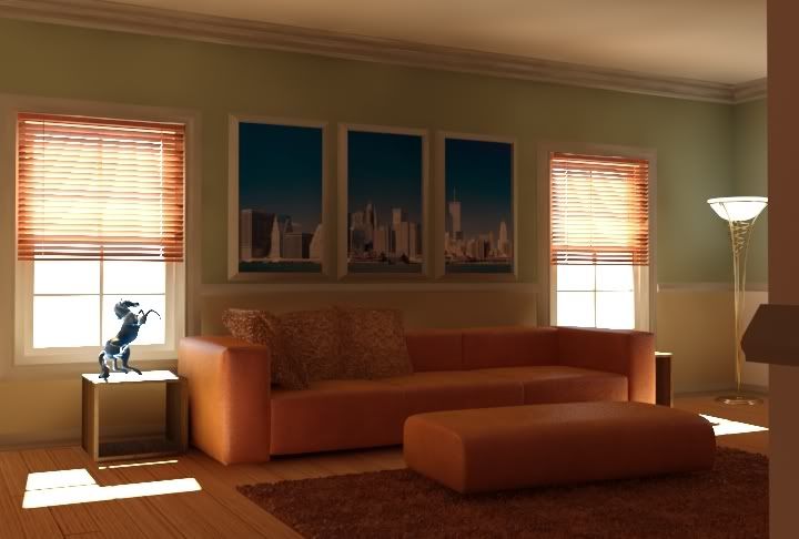
    Here is the same with blinds and the same reinhard settings.....Should I brighten a bit?
    Eric Camper
    Studio 3D
    www.dbfinc.com/studio3d

    Comment


    • #32
      What I always have the hardest time with is the areas around intricate moldings like you have there. A lot of it, I've noticed, has to do with the 2nd bounce light cache settings. But I haven't really found anything that works very well.
      Tim Nelson
      timnelson3d.com

      Comment


      • #33
        yeah on my LCD its way too dark.

        Comment


        • #34
          What is the best way to have my background show up? I have been doing this in PS with a png file, but I wasn't sure if I could change the background without affecting the sky/sun thing. Do I put a plane outside the window and do I have the light ignore it..etc..etc..Thanx
          Eric Camper
          Studio 3D
          www.dbfinc.com/studio3d

          Comment


          • #35
            Use the vray environment overrides for your sky and put your background map in the max environment slot.

            Comment


            • #36
              ^ Don't forget to set the envir mapping on the bitmaps in the max environment slot to "Screen" or whatever your image is.
              Colin Senner

              Comment


              • #37
                Ok...small update...splotches gone.....HEmi at 250....But I am slowly bringing it down...


                Too bright...not bright enough...etc..etc..

                Thanx
                Eric Camper
                Studio 3D
                www.dbfinc.com/studio3d

                Comment


                • #38
                  ERIC,
                  good improvement, but i am still feeling the unbalance between the bright spot flooring versus the background out there. imo, if you want to keep the bright spot inside, we have to turn the background image much brighter than now, but if you want to keep that background color, i'd darken the bright spot on the floor.

                  and if you don't mind, those blue pictures on the wall are not complimenting the scene. try something more subtle in saturation. well that's my opinion.

                  i know i should've commented on the splotches and blotches, which are not there any longer .

                  keep up the good work,
                  Dominique Laksmana

                  Comment


                  • #39
                    this is just one reason why i never ever use photoshoped background. you have a halo around objects like the horse because it's showing the image sampling of the white background. speaking of image sampling, you will have a much, much better image if you up the image sampling. go just 1 value higher for your Min value and i think you will see major improvements.

                    also, that interior light really should be turned off and you should return color mapping to reinhard and just tweak the burn value

                    looks very sweet though, good job
                    Brian Smith
                    www.3dats.com
                    3D Architectural Training Solutions

                    Comment


                    • #40
                      I did turn off the light, but the material for the lamp was a vraylight..Oops... I shall up the image sampling a tad....BUT the color mapping IS reinhard, with a burn value of 0. Should I up it?

                      Yeah...the client lives in New york and this was a summer home and I mentioned it would be cool....the original had a fall tree thingy....maybe I will go back to it.


                      Changing the background now...Thanx all for your help
                      Eric Camper
                      Studio 3D
                      www.dbfinc.com/studio3d

                      Comment


                      • #41
                        well if you have reinhard with a burn set to 0...that's exponential with 1.0 bright and dark multipliers....yet the image looks completely different than the exponential image you posted earlier. something's amiss. nonetheless, i think the color mapping looks great as is, regardless of the settings your using. i wouldn't change it.

                        i just noticed that you said earlier you used a HSph Subdivs of 250. That is insanely high. What kind of rendering times are you getting. When posting images like this, i recommend using the stamp and typing a description of the major settings your using. I would like to see the difference in quality and render time using a HSph Subdivs of 20. Assuming you have you interp samples high enough (approx 50-100), you wont get the splotches you had.
                        Brian Smith
                        www.3dats.com
                        3D Architectural Training Solutions

                        Comment


                        • #42
                          Cool...not changing a thing...But I am running 4 test renders tonight......

                          1 - with Hemi at 20, 720-486
                          2 - with Hemi at 100, 720-486
                          3 - with Hemi at 20, 720-486 DETAIL ENHANCE
                          4 - with Hemi at 100, 720-486 DETAIL
                          5 - with Hemi at 100, 3600-2400

                          SHall post the result tomorrow...But it was rendering pretty fast....I mean compared to the older Dual Xeon. The Dual Quad 5355 kicks....
                          Eric Camper
                          Studio 3D
                          www.dbfinc.com/studio3d

                          Comment


                          • #43
                            IMO it would look a lot better if you got rid of the skyline photos and put in a nice Renoir or something.
                            Eric Boer
                            Dev

                            Comment


                            • #44
                              william dekooning imo would blow this interior out of the water!
                              or a Rauschenberg just me though . For the plainer at heart go with a Mark Rothko
                              Colin Senner

                              Comment


                              • #45
                                Originally posted by EricCamper
                                Cool...not changing a thing...But I am running 4 test renders tonight......

                                1 - with Hemi at 20, 720-486
                                2 - with Hemi at 100, 720-486
                                3 - with Hemi at 20, 720-486 DETAIL ENHANCE
                                4 - with Hemi at 100, 720-486 DETAIL
                                5 - with Hemi at 100, 3600-2400

                                SHall post the result tomorrow...But it was rendering pretty fast....I mean compared to the older Dual Xeon. The Dual Quad 5355 kicks....
                                Cool....just remember that detail won't make a lick of difference if your image sampling is not set properly. The render times will go up either way but if image sampling is set too low, you won't see any difference in the image. Detail enhancement comes with a hefty price in rendertime and i would only use it as a last resort. Personally i haven't ever resorted to using it but I don't mean to bad mouth it if i come across that way.

                                I agree about the framed images. I liked the original outdoors images much better.
                                Brian Smith
                                www.3dats.com
                                3D Architectural Training Solutions

                                Comment

                                Working...
                                X