Hi,
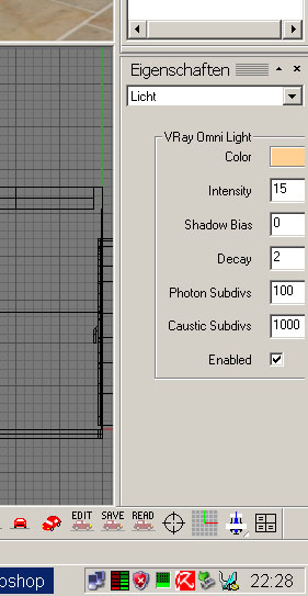
if the dialog box of the light properties is narrow, than I miss a scroll bar like in the layer manager (top of the image). Also I think, the properties could be better arranged, so that less space is needed.
For example the properties of the arealight need to much space. On the left side from the left line is much empty space. Also I think the parameter fields and the color field could be smaller or is a subdivs of 9,999,999 useful?

PS: Do I something wrong with the image code? It is not direct shown here.
if the dialog box of the light properties is narrow, than I miss a scroll bar like in the layer manager (top of the image). Also I think, the properties could be better arranged, so that less space is needed.
For example the properties of the arealight need to much space. On the left side from the left line is much empty space. Also I think the parameter fields and the color field could be smaller or is a subdivs of 9,999,999 useful?

PS: Do I something wrong with the image code? It is not direct shown here.
Comment