 Tweet
Tweet
Re: Improvement Needed
Hi BillyRayGun,
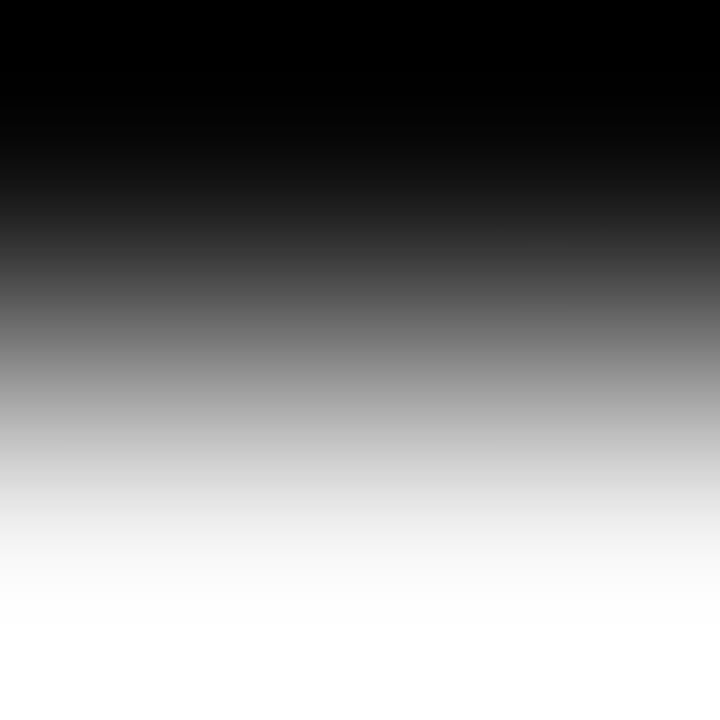
By gradient, I mean like this one
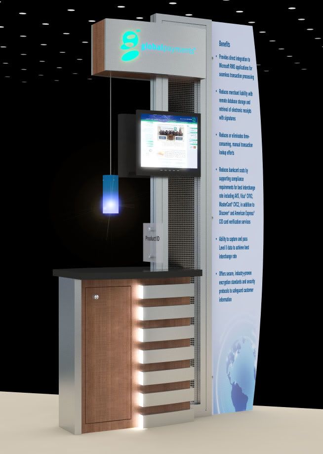
To create items like pendant lights, like this one:
For the Photoshop filter, I use this process:
1) create a copy of the image ABOVE the original image in your layers
2) go to, "image - adjustments - levels" and tweaked the levels untill all you see are the brightest parts of the image
3) select "screen" for this adjusted image
4) then go to "filter, blur, gausian blur". It is not until now that you'll see a bright halo around the lights in your image. Adjust the blur level until you are happy with the resulting "glow"
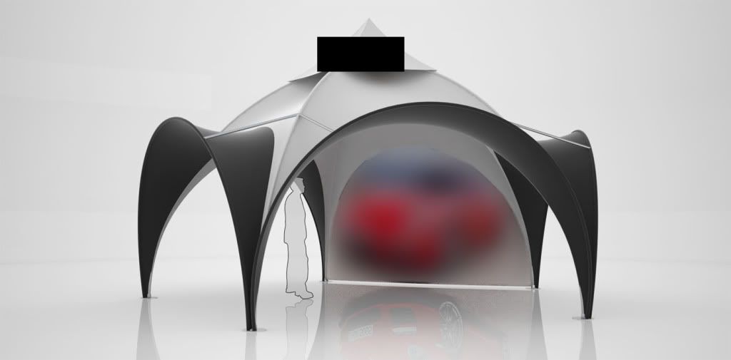
As for the tension fabric structure, here's an example (for confidentiality reasons I had to cover the logo and blur the graphic, sorry). You can see that adding a slight reflection to the fabric as I mentioned helps to carry the light across it and helps to define the shape a little better. You can play with the velvet materials too, but they are a little strong, I'd suggest adjusting them to get more of a tension fabric look.
Hope this helps!
Hoop
Hi BillyRayGun,
By gradient, I mean like this one
To create items like pendant lights, like this one:
For the Photoshop filter, I use this process:
1) create a copy of the image ABOVE the original image in your layers
2) go to, "image - adjustments - levels" and tweaked the levels untill all you see are the brightest parts of the image
3) select "screen" for this adjusted image
4) then go to "filter, blur, gausian blur". It is not until now that you'll see a bright halo around the lights in your image. Adjust the blur level until you are happy with the resulting "glow"
As for the tension fabric structure, here's an example (for confidentiality reasons I had to cover the logo and blur the graphic, sorry). You can see that adding a slight reflection to the fabric as I mentioned helps to carry the light across it and helps to define the shape a little better. You can play with the velvet materials too, but they are a little strong, I'd suggest adjusting them to get more of a tension fabric look.
Hope this helps!
Hoop

Comment