Announcement
Collapse
No announcement yet.
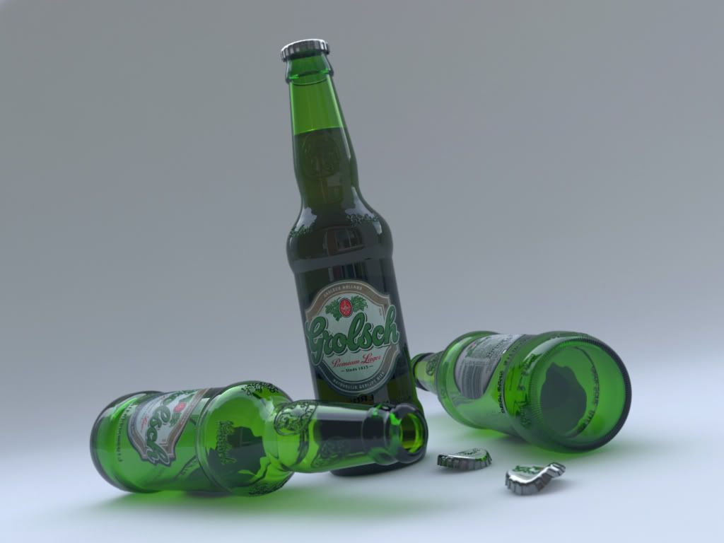
First post - inspired by thirst :)
Collapse
X
-
-
hmmm the monitor at work was abit dark it does look a little brighter at home. However I was comparing the 2 pictures I was meaning in general. I would have choose a brighter image over all perhaps its the label, just seems abit dull to me.
And the brighter caustics certainly do help spark things up abit.
Comment
-
we have littl ebi of confusion about the whole LWF at the moment....sometimes i render on a CRT, sometimes on LCD...i dont even know if i am using the whole LWF right...ive patiently read through all the topics but i am getting more and more confused as i read further...
My LCD seems to be set to gamma 1.0 (as it says in monitor properties)....if I use lukx LWF tutorial (system gama 2.2, input 2.2, output 1.00 and gamma mapping to 1/0.454) i get washed out renders....
the images were all rendered with system gama 1.0/in1.0/out/1.0 plus gamma correction 1/1......the first on was rendered on my LCD....the second one on CRT with exactly the same settings....
I am starting to get pretty desperate as ive read through everything....
Any suggestions?
Comment
-
hi:Originally posted by teabagMy LCD seems to be set to gamma 1.0 (as it says in monitor properties)....if I use lukx LWF tutorial (system gama 2.2, input 2.2, output 1.00 and gamma mapping to 1/0.454) i get washed out renders....
u get whased out results because there s too much light...try to redo ur light settings by reducing the multipliers till u balanced them on spot...

u have to callibrate ur monitor as an independent step to optimize the way ur display quality...u can search some older threads...throb s thread for example, where we has shed some light on that subject and introduced all this lwf here....
Comment
-
You may also need to correct your maps. Put color correct on all your maps and color swatchs and see how that goes.
Changing the light may not help that. So color correct or PS work still be necessary for the texture maps.
Also you just ran out of bandwidth at your image host time to find a new .. better one.
Comment
-
yep.....ive just found that out too.....
ill have to reserve some time this week to get my teeth to it a bit more...
Comment
-
2pentool:
the label is geometry..therefore its just another material with different setting...but i think you could use a mixmap if you want create one without extra modelling efforts..
Comment
-
Geometry!? You mean the round label that says "Grolsch" is geometry!? Hmmm... it looks like only a bitmap mapped onto the side. My label was reflecting just like the glass (when I assigned the bitmap to the diffuse channel) and that's why I was wondering how you mapped it onto the glass's surface.
=LES=
Comment
-
Looking good, but I prefer the first image except for 2 things: as has been addressed, it looks like you are double gamma correcting the label image... try setting your bitmap input gamma to 2.2. Also, maybe its a modeling issue, but the bottle cap looks kind of fake."Why can't I build a dirigible with my mind?"
Comment
-
Pentool:
Have a look here, might help you.
http://www.chaosgroup.com/forum/phpB...ht=decal+glass
http://www.chaosgroup.com/forum/phpB...ht=decal+glass
Comment
-
To Clifton:
i fully agree...i havent had time to return to that project yet..hopefully i ll do it today between jobs
To pentool: yep ...geometry...as i couldnt find out the way how to do it by textures with all the maps and uvws..thanks to you and gijss post i know now )))
)))
Comment
-
here is an update...ive converted the scene to lwf

..do you think those displacement reflection on the backside of the glass are rsupposed to be there? co i am not sure...
...does anyone have an experience with a studio lighttable setup?
i was experimenting with adding a gradient ramp in vraylightmat and applying it to the plane i am using in the image..it look ok, but i would also like to add a little reflection to the mat. how would i do that? or is it possible to combine vraylightmat and reflection together???
ive been thinking about doing it in geometry by cloning the plane rescaling slightly and giving it a semi transparent reflective mat. underneath i would have the current plane with vraylightmat with gradient ramp applied to simulate the fading light..
cheers for comments and ideas
Martin[/img]
Comment


Comment