If this is your first visit, be sure to
check out the FAQ by clicking the
link above. You may have to register
before you can post: click the register link above to proceed. To start viewing messages,
select the forum that you want to visit from the selection below.
Exciting News: Chaos acquires EvolveLAB = AI-Powered Design.
To learn more, please visit this page!
New! You can now log in to the forums with your chaos.com account as well as your forum account.
Thank!...Yes, it's easy to render and also to model a donut...the difficult was to find the more realitstic Dept Of Field...but materials and models are really basic...
1 very realistic might need some improvement on ground plane shadows
2 and 3 lacks shadow and reflection quality also the wood might be reflective or has some bump map
4 that glass only made from too thin glass in real life and cannot be used for cup so not realistic for me
5 very good render yet white material has color reflection not preferred in real life and maybe front reflection of red cup might be dimished over distance for more realism
6 7 cool but pattern on ground distracts too much if you will use checker maybe bigger checkers might be better wood is cool but not sure if the stripes of wood placed correctly you might work on metal reflection for more realism it dont match the wood
8 cool colorful rendering you might revise the 2 front pieces color and add some gray or black to the color for more realism
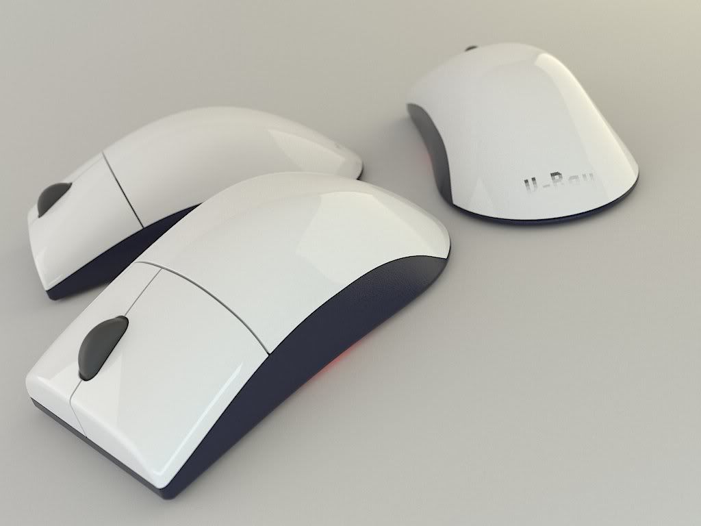
9 really cool colors maybe in the gray colors you might desaturate the reflections it might add to the realism
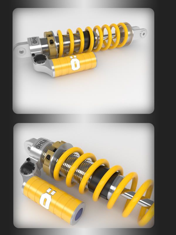
10 really good modelling and render the chrome material might be changed for a bit more gray or less sharp reflection
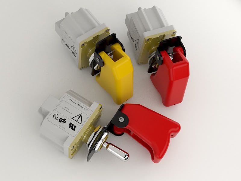
11 really cool modeling and render the yellow parts might use more reflection for metal effect and a bit less reflection for the part that contains the brand
not sure if it helps but my detailed critics are like these
but you do really great job in this renders maybe you can try focusing more on modelling bigger parts like vehicles or render bigger environments because you do these parts quite well already
This is for Italian V-Ray site.
You can find the entire tutorial on www.vray.it
Great renders! I really like your way of working, I have checked out the vray.it website, I can't speak Italian, but the bold orange lines help me understand how you work. I'm going to try this setup!
I think you can use more contrast in these images. Specifically, the tabletop is too grey and is competing with the products. Try using a lighter diffuse color and/or a more reflective materials. Make your product POP out of the background.
Yeah, but first I'd download the model from http://www.3dcontentcentral.it and I've made some changes on it with Solidworks (like some fillets, round, etc.).
All the rest was made using Rhino 4.0 and VRay for Rhino 1.49 core.
 Tweet
Tweet


Comment