Announcement

Collapse
No announcement yet.

Reading Room(Updated)

Collapse
X
 
  • Filter
  • Time
  • Show
Clear All
new posts

  • Reading Room(Updated)

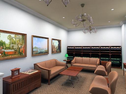
    Please suggest for improvements...
    Reza Bahari
    visual3d@streamyx.com
    013-3428162

  • #2
    dont mean to sound cruel or anything. but here is my list so far
    a: you have a floating table to the right just out of shot.
    b: no apparent light source. looks like its lit from or something with a huge area light or something but certainly not from those lights
    c: the books or whatever they are int he back are too dark and just looks like wasted pixels.
    d: the little green lamp looks out of place there and it might be whats causing that weird green glow over on the right hand wall next to the books or whatever they are.

    ---------------------------------------------------
    MSN addresses are not for newbies or warez users to contact the pros and bug them with
    stupid questions the forum can answer.

    Comment


    • #3
      heheheh

      youre right, the table seem like its floating cause its not casting any shadow...reason is im using a single vray light which is 2000x2000 in size..so i guess it to far out of range...the light in the corner will have to go, and i forgot to unhide the light for the ceiling..hehehehe....but apart from that, is there anything i can do about the settings for rendering.
      Reza Bahari
      visual3d@streamyx.com
      013-3428162

      Comment


      • #4
        well. i probably wouldnt use the large vray light at the top. it makes the room seem unnatural.

        ---------------------------------------------------
        MSN addresses are not for newbies or warez users to contact the pros and bug them with
        stupid questions the forum can answer.

        Comment


        • #5
          turn the chairs around a little...might help make it look less stiff
          Digital Progression

          Comment


          • #6
            Updated....client still want the green lamp....too bad.

            Reza Bahari
            visual3d@streamyx.com
            013-3428162

            Comment


            • #7
              The indication of light sources is better now, but I would rather use the warmer light color as in the first rendering.

              so long

              marc

              Comment


              • #8
                The lighting is a lot better now, the light sources are now obvious whereas previously there didn't seem to be a definate light source. Maybe add a very slight yellowy tinge to your lights to warm things up. The table is still floating, although it's not as obvious. There's always photoshop

                Overall though it's looking really good.

                -Matt

                Comment

                Working...
                X